1. Comparing Wages With Consumer Price Index Data
How many people do you know who have a favorite US government department? I’ve got a favorite, and I’m not even American. It’s the Bureau of Labor Statistics, and I’ve been enjoying the torrents of employment and economics-related data they produce for decades, now.
But my admiration for BLS jumped to a new level when I discovered their well-supported application programming interface (API). This opens up all that delicious data to smart retrieval through our Python scripts. And it gives us some rich resources for discovery.
Let me illustrate with a relatively simple example. I’m going to use the API to request US consumer price index (CPI) and wage and salary statistics between 2002 and 2020.
The CPI is a measure of the price of a basket of essential consumer goods. It’s an important proxy for changes in the cost of living which, in turn, is an indicator of the general health of the economy.
Our wages data will come from the BLS Employment Cost Index covering “wages and salaries for private industry workers in all industries and occupations.” A growing employment index would, at first glance, suggest that things are getting better for most people.
However, seeing the average employment wages trends in isolation isn’t all that useful. After all, the highest salary won’t do you much good if your basic expenses are higher still. I know what I’m talking about here, since I grew up in the 1970s. Back then, high inflation would often completely cancel out the value of a raise at work. (Although I can’t say I remember that having too much of an impact on my brief career as a before-school newspaper carrier earning $10-15 a week.)
So the goal is to pull both the CPI and wages data sets and then correlate them. This will show us how wages have been changing in relation to costs.
Working With the API
There are two and a half things you’ll need to successfully access the API:
- BLS endpoint addresses matching the specific data series you need
- Python code to launch the request
- (In case you’ll need them) A BLS API key to unlock higher request rates
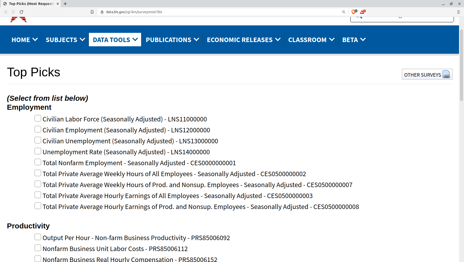
Getting the series endpoint addresses you need may take some digging around in the BLS website. However, the most popular data sets are accessible through a single page. The following image shows you what that looks like, including the endpoint codes - like “LNS11000000” for the Civilian Labor Force set.

You can also search for data sets on this page. Searching for “computer,” for instance, will take you to a list that includes the deeply tempting “Average hourly wage for level 11 computer and mathematical occupations in Austin-Round Rock, TX.” The information you’ll discover by expanding that selection will include its series ID (endpoint) of “WMU00124201020000001500000011”
Because I know you can barely contain your curiosity, I’ll tell you that it turns out that level 11 computer and mathematical professionals in Austin-Round Rock, Texas could expect to earn $51.76/hour in 2019.
How do you turn series IDs into Python-friendly data? Well that’s what we’ll learn next.
Getting the GET and PUT requests exactly right can be complicated. But because I enjoy a simple life, I decided to go with one of the available third-party Python libraries. The one I use is called, simply, bls and is available through Oliver Sherouse’s GitHub repo. You install the library on your host machine using:
pip install bls
While you’re at the command line, you might as well activate your BLS API key. You register for the API from this page. They’ll send you an email with your key and a validation URL that you’ll need to click.
Once you’ve got your key, you export it to your system environment. On Linux or macOS, that would mean running something like this (where your key is substituted for the invalid one I used):
export BLS_API_KEY=lk88af0f0d5fd1iw290s52a01b8q
Working with CPI and salary data
With that out of the way, we’re all set to start digging for CPI and employment gold. Importing these four libraries - including bls will give us the tools we’re going to need:
import pandas as pd
import matplotlib as plt
import numpy as np
import bls
Now I pass the BLS endpoint for the wages and salaries data series to the bls.get_series command from the bls library. I copied the endpoint from the popular data sets page on the BLS website. I’ll assign the data series that comes back to the variable wages and then take a look at a sample from the data set.
wages = bls.get_series('CIU2020000000000A')
wages
0	2002Q1	3.5
1	2002Q2	3.6
2	2002Q3	3.1
3	2002Q4	2.6
4	2003Q1	2.9
Assessing our two data series
For now, just note how the format of the first column of data consists of a year (2002, 2003, etc.) followed by the financial quarter (Q1, Q2, etc.) and the fact that the second column (3.5, 3.6) consists of percentages. We’ll get back to that data set later. But right now we’ll switch over to the CPI series.
We’ll pull the CPI data series as the variable, cpi. I’ll export the data to a CSV file named cpi_data.csv so it’ll be available to me even if I accidentally overwrite the variable. I also happen to find it a bit easier to work with CSV files.
At any rate, I’ll then read the CSV into a dataframe called cpi_data and do a bit of formatting by adding two column headers (Date and CPI).
cpi = bls.get_series('CUUR0000SA0')
cpi.to_csv('cpi_data.csv')
cpi_data = pd.read_csv('cpi_data.csv')
cpi_data.columns = 'Date','CPI'
Here’s what my data will look like:
cpi_data
	Date	CPI
0	2002-01	177.100
1	2002-02	177.800
2	2002-03	178.800
3	2002-04	179.800
4	2002-05	179.800
...	...	...
222	2020-07	259.101
223	2020-08	259.918
224	2020-09	260.280
225	2020-10	260.388
226	2020-11	260.229
227 rows × 2 columns
If we want to correlate this CPI data with the wages series, the logical approach is to compare changes in both data sets as they occurred through time. But before that can happen, we’ll need to overcome two serious problems:
- The CPI data is monthly while the wages data is quarterly (i.e., four increments per year). And the Date column in the CPI set is formatted differently (2002-01) than that of the wages set (2002Q1). Python won’t know how to compare those columns as they currently exist.
- The CPI values are measured in points (177.10, etc.) while the wage changes are presented as percentages (3.5, etc). Those, too, won’t be comparable in any useful way unless we clean things up a bit.
Manipulating the CPI data series
Python is built to be helpful in fixing those problems. Sure, I could always open up the data in CSV files and manually edit each row. But that would be boring and time consuming for the hundreds of rows we’re working with. And it would be impossible for the millions of rows of data used by many other analytics projects.
So we’re going to automate our data clean up.
We’ll focus first on the CPI series. I’m going to use the Python str.replace method to search for any occurrence of -03 (i.e., “March”) in the Date column, and replace it with the string Q1. This will match the Q1 records in my wages data set. I’ll then do the same for the June, September, and December rows.
cpi_data['Date'] = cpi_data['Date'].str.replace('-03', 'Q1')
cpi_data['Date'] = cpi_data['Date'].str.replace('-06', 'Q2')
cpi_data['Date'] = cpi_data['Date'].str.replace('-09', 'Q3')
cpi_data['Date'] = cpi_data['Date'].str.replace('-12', 'Q4')
I’m sure there’s syntax that would allow me to do all that in one line, but the couple of seconds it took me to copy and paste those lines hardly compared to the time it would have taken me to figure out the “more efficient” alternative. If automation threatens to take me longer than the manual way, then I vote for manual every time.
We can print out some data to show us what we’ve got so far:
cpi_data['Date']

0      2002-01
1      2002-02
2       2002Q1
3      2002-04
4      2002-05
        ...
222    2020-07
223    2020-08
224     2020Q3
225    2020-10
226    2020-11
Name: Date, Length: 227, dtype: object
The quarterly records are exactly the way we want them, but the rest are obviously still a problem. We should look for a characteristic that’s unique to all the records we don’t want to keep and use that as a filter. Our best (and perhaps only) choice is the dash ("-"). The str.contains method when set to False will, when run against the Date column as it is here, drop all the contents of all rows that contain a dash.
newcpi_data = cpi_data[(cpi_data.Date.str.contains("-") == False)]
You’ll want to confirm everything went as planned by printing a sample of your data. Everything here looks great. Note how there are now only 75 rows of data, as opposed to the 227 we began with.
newcpi

	Date	CPI
2	2002Q1	178.800
5	2002Q2	179.900
8	2002Q3	181.000
11	2002Q4	180.900
14	2003Q1	184.200
...	...	...
212	2019Q3	256.759
215	2019Q4	256.974
218	2020Q1	258.115
221	2020Q2	257.797
224	2020Q3	260.280
75 rows × 2 columns
If you like, you can save the data series in its final state to a CSV file:
newcpi_data.to_csv('cpi-clean.csv')
Converting percentages to “CPI” values
Well that’s our formatting problem out of the way: we’ve converted the CPI data to quarterly increments and cleaned up the date format to match the wages data. Now we’ll need to address the inconsistency between the absolute point values in the CPI set and the percentages that came with the wages data.
First, lets go get that data. Technically, if you’ve been following along on your own, you’ll already have pulled the series back near the beginning, but it can’t hurt to run it again. Once again, I’ll save the data to a CSV file (which, again, isn’t necessary), push it to a dataframe I’ll call df, and give it column headers. Naming the date column Date to match the CPI set will make things easier.
wages = bls.get_series('CIU2020000000000A')
wages.to_csv('bls_data_csv')
df = pd.read_csv('bls_wages_data_csv')
df.columns = 'Date','Wages'
The sample data we print looks just fine:
df.head()
	Date	Wages
0	2002Q1	3.5
1	2002Q2	3.6
2	2002Q3	3.1
3	2002Q4	2.6
4	2003Q1	2.9

newdf = df
Now, I should warn you that there’s going to be some Fake Math(tm) here.
What’s going on? Each of the percentages in the wages data series represents an annual average. So when we’re told that the rate for the first quarter of 2002 was 3.5%, that means that if wages continued to rise at the current (first quarter) rate for a full 12 months, the annual average growth would have been 3.5%. But not 14%.
Which means the numbers we’re going to work with will have to be adjusted. That’s because the actual growth during, say, the three months of 2002 Q1 wasn’t 3.5%, but only one quarter of that (or 0.875%). If I don’t make this adjustment, but continue to map quarterly growth numbers to quarterly CPI prices, then our calculated output will lead us to think that wages are growing so fast that they’ve become detached from reality.
And here’s where part of the fake math is going to rear its ugly head. I’m going to divide each quarterly growth rate by four. Or, in other words, I’ll pretend that the real changes to wages during those three months were exactly one quarter of the reported year-over-year rate. But I’m sure that’s almost certainly not true and is a gross simplification. However, for the big historical picture I’m trying to draw here, it’s probably close enough.
Now that will still leave us with a number that’s a percentage. But the corresponding CPI number we’re comparing it to is, again, a point figure. To “solve” this problem I’ll apply one more piece of fakery.
To convert those percentages to match the CPI values, I’m going to create a function. I’ll feed the function the starting (2002 Q1) CPI value of 177.10. That’ll be my baseline. I’ll give that variable the name newnum.
For each iteration the function will make through the rows of my wages data series, I’ll divide the current wage value (x) by 400. 100 simply converts the percentage (3.5, etc.) to a decimal (0.035). And the four will reduce the annual rate (12 months) to a quarterly rate (3 months).
To convert that to a usable number, I’ll multiply it by the current value of newnum and then add newnum to the product. That should give us an approximation of the original CPI value adjusted by the related wage-growth percentage.
But, of course, this won’t be a number that has any direct equivalent in the real world. Instead, it is, as I said, an arbitrary approximation of what that number might have been. But, again, I think it’ll be close enough for our purposes.
Take a couple of minutes and read through the function. global newnum declares the variable as global. This makes it possible for me to replace the original value of newnum with the function’s output so the percentage in the next row will be adjusted by the updated value. Note also how any strings (str) will be ignored. And, finally, note how the updated data series will populate the newwages_data variable.
newnum = 177.1
def process_wages(x):
    global newnum
    if type(x) is str:
        return x
    elif x:
        newnum = (x / 400) * newnum + newnum
        return newnum
    else:
        return
newwages = newdf.applymap(process_wages)
Let’s check that new data:
newwages

	Date	Wages
0	2002Q1	178.649625
1	2002Q2	180.257472
2	2002Q3	181.654467
3	2002Q4	182.835221
4	2003Q1	184.160776
...	...	...
70	2019Q3	273.092663
71	2019Q4	275.140858
72	2020Q1	277.410770
73	2020Q2	279.421999
74	2020Q3	281.308097
75 rows × 2 columns
Looks great.
Merge and plot our dataframes
What’s left? We need to merge our two data series. But since we’ve already done all the cleaning up and manipulation, this will go smoothly. I’ll create a new dataframe called merged_data and feed it with the output of this pd.merge function. I simply supply the names of my two dataframes, and specify that the Date column should be the index.
merged_data = pd.merge(newcpi_data, newwages_data, on='Date')
Fast and friendly. No trouble at all. Go ahead and take a look:
merged_data
	Date	CPI		Wages
0	2002Q1	178.800	178.649625
1	2002Q2	179.900	180.257472
2	2002Q3	181.000	181.654467
3	2002Q4	180.900	182.835221
4	2003Q1	184.200	184.160776
...	...	...	...
70	2019Q3	256.759	273.092663
71	2019Q4	256.974	275.140858
72	2020Q1	258.115	277.410770
73	2020Q2	257.797	279.421999
74	2020Q3	260.280	281.308097
75 rows × 3 columns
Our data is all there. We could visually scan through the CPI and Wages columns and look for any unusual relationships, but we didn’t come this far to just look at numbers. Let’s plot the thing.
Here we’ll tell plot to take our merged dataframe (merged_data) and create a bar chart. Because there’s an awful lot of data here, I’ll extend the size of the chart with a manual figsize value. I set the x-axis labels to use values in Date column and, again because there are so many of them, I’ll rotate the labels by 45 degrees to make them more readable. Finally, I’ll set the label for the y-axis.
ax = merged_data.plot(kind='bar', figsize=(20, 7))
ax.set_xticklabels(merged_data.Date, rotation=45)
ax.set_ylabel('CPI vs. Wages and salaries - 12-month change')
ax.set_xlabel('Dates')
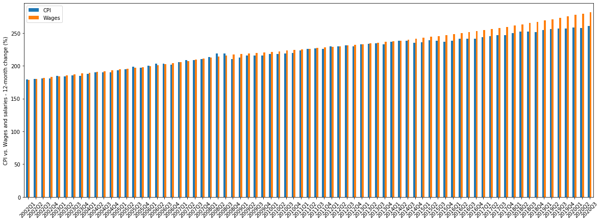
And this is what I got:

Because of the crowding, it’s not especially easy to read. But you can see that the orange “Wages” bars are, for the most part, higher than the blue “CPI” bars. We’ll have a stab at analyzing some of this in the next chapter.
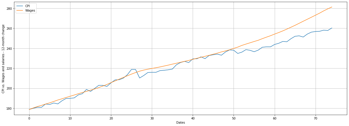
Is there an easier way to display all this data? You bet there is. I can change the value of kind from bar to line and things will instantly improve. Here’s how the new code will work as a line plot and with a grid:
ax = merged_data.plot(kind='line', figsize=(20, 7))
ax.set_ylabel('CPI vs. Wages and salaries - 12-month change')
ax.set_xlabel('Dates')
ax.grid()
And here’s our new chart:

In the next chapter, we’ll try to better understand the data we’re using and then add historical S&P 500 index data as another metric.