6. Does Regional Wealth Influence the Prevalence of Mental Illness?
Having access to Python and Jupyter Notebook data analytics tools is empowering and, frankly, just plain fun. Ever argue with someone about a political or scientific subject and wish you could pull out a convincing argument that shuts the debate down? You know the kind I mean: “How come extreme weather events are happening so much more often than they used to?” I used to hear. “Actually,” I can now cheerfully reply, “They’re not."
While learning more about the prevalence of various mental illnesses can’t really be called “fun,” it should at least be satisfying. And, considering how much excellent medical statistical data exists out there, it shouldn’t be hard to get started.
What am I after here? We’ve always known that economic development has a measurable impact on health outcomes in general. The kinds of infrastructure that deliver clean water and well-supplied hospitals will cost a lot of money. But what about a connection between wealth and mental illnesses? Are people living in wealthy societies more or less likely to suffer from one or another form of mental illness? I’ve got some assumptions on that topic I’d like to test.
I have to pause here for a clear and emphatic disclaimer. I am not a mental health or medical professional. I have no training in either field and my opinions are therefore nothing more than opinions. Everything I’m going to say here in relation to mental health conditions should be understood in that context.
Furthermore, regardless of what I’m going to say, the fact is that anyone suffering from a mental illness should seek professional guidance and therapy. These are very serious issues and my assumptions and speculation should never be used as a substitute for professional care - or as an attempt to minimize anyone’s suffering.
The financial data I’m using here comes from the World Bank data.worldbank.org site and presents per capita gross domestic product numbers from 2019.
import pandas as pd
import numpy as np
import matplotlib as plt
import matplotlib.pyplot as plt

gdp = pd.read_csv('WorldBank_PerCapita_GDP.csv')
gdp.head()
	Country	Value
0	Afghanistan	2156.4
1	Albania	14496.1
2	Algeria	12019.9
3	American Samoa	NaN
4	Andorra	NaN
The health data is from the GHD Results Tool on the Global Health Data Exchange site. I used their drop-down configurations to select data by country that focused on the prevalence of individual illnesses measured as a rate per 100,000. These records also represent 2019.
After selecting just the two columns that interest me from each of the health CSV files (“Country” and “Val” - which is the average prevalence rate of the illness per 100,000 over the reporting period), here’s what my data will look like:
anx = pd.read_csv('anxiety.csv')
anx = anx[['Country','Val']]
anx.head()
	Country	Val
0	Afghanistan	485.96
1	Albania	258.95
2	Algeria	817.41
3	American Samoa	73.16
4	Andorra	860.77
My assumptions
I’m only trying to measure prevalence, not outcomes or life expectancy. In that context, I would expect that medical conditions which seem related more to organic than environmental conditions should appear more or less evenly across societies at all stages of economic development. The prevalence of conditions that are more likely the result of environmental influences should, on the other hand, vary between economic strata.
Here’s my untested theory: relative wealth, to some degree, frees people from many primary worries like finding their next meal and a safe place to sleep that night. As access to material benefits spreads, populations enjoy more leisure time, allowing individuals to spend only a finite number of a day’s hours at work, and leaving the rest for personal pursuits.
Free time, as we all know, comes with its own costs. The lifestyle changes that result can introduce many unintended consequences, including those that impact our health and well being. To me it feels intuitive that the “anxiety disorders” category might include illness resulting from some “free time-induced” stresses.
Or, to put it a different way, people faced by immediate existential threats (like war or extreme poverty) would be less likely to notice or worry about many of the “first-world” concerns that make us anxious. This is certainly not to suggest that such suffering isn’t real or important. But it would seem it should be unique to wealthier times and places. In addition, populations with less money and weaker access to mental health professionals are likely to see fewer positive diagnoses of anxiety disorders - even if the illness were present in equal numbers.
Conversely, I would expect incidents of schizophrenia to be more evenly distributed across all regions: after all what are the economic factors that could play a role, here? Aren’t the primary risk factors for schizophrenia recreational drug use, childhood trauma, and genetics? These, unfortunately, would seem to be relatively uniform across all societies. And even if, like anxiety disorders, schizophrenia was under reported, the two effects would just cancel each other out when we compare them.
That’s what I expected. Let’s see what I actually got.
Plotting the data
After loading the libraries we’ll need to generate a scatter plot, I’ll merge my anxiety disorder data frame (anx) with the GDP data using pd.merge. I would do the same to merge my schrizophrenia data (sch).
import plotly.graph_objs as go
import plotly.express as px
merged_data_anx = pd.merge(gdp, anx, on='Country')
merged_data_anx = merged_data_anx[['Country', 'Value', 'Val']]
merged_data_anx.dropna(axis=0, how='any', thresh=None,
                   subset=None, inplace=True)
Plotting the graph won’t involve anything we haven’t seen before in these projects. The labels argument is used to make the plot more readable by assigning descriptive axis labels.
fig = px.scatter(merged_data_anx, x="Val", y="Value",
                 trendline="ols", log_x=True,
                 labels={
                     "Value": "GDP (in dollars)",
                     "Val": "Prevalence of Anxiety Disorders (/100k)"
                 },
                 hover_data=["Country", "Val"])
fig.show()
And here’s what came out the other end:
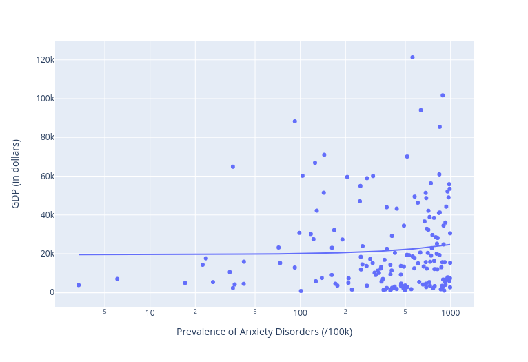
Whoops. That doesn’t look anything like what I expected. As you can see, the regression line is nearly flat, indicating that there’s very little variance in prevalence between rich and poor nations. In fact, there’s quite a cluster of high-prevalence countries at the right edge of the X-axis along the very bottom (i.e., the least wealthy regions). If anything, anxiety disorders are more prevalent in countries with lower GDP.
Ok. So what about schizophrenia? Here’s how that went:
fig = px.scatter(merged_data_sch, x="Val", y="Value",
                 trendline="ols", log_x=True,
                 labels={
                     "Value": "GDP (in dollars)",
                     "Val": "Prevalence of Schizophrenia (/100k)"
                 },
                 hover_data=["Country", "Val"])
fig.show()
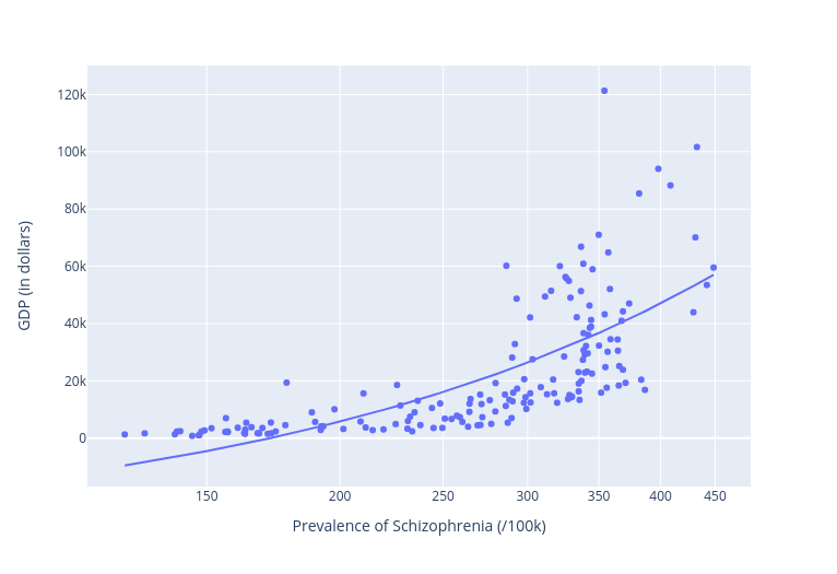
Another whoops. Here we’re getting a significant increase in prevalence of schizophrenia as we move up the Y-axis towards higher GDP rates. The lowest rate among “developed” nations was Denmark, which reported a rather high 286 cases per 100,000.
So I’m 0 for 2. My intuition was clearly wrong.
To confirm all this, let’s push that flawed intuition a bit further. I’ll take a medical disease that should have - at best - minimal cultural connections. If there were even a shred of truth to my assumptions, we should see very little variation between countries. Well, using all the same code, here’s how that turned out for pancreatic cancer:
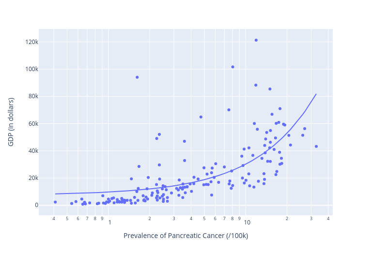
Again: not at all what I would have predicted. That clear upward slope of the regression line (or trendline) shows us an unmistakable correlation between higher wealth and higher incidents of pancreatic cancer. What’s going on here?
Thinking about our data
The simple answer is that I have no clue what I’m doing. And as a general rule, that’ll be a safe bet. But it would still be nice to have some sense of at least the outline of the problem.
So here are some thoughts.
Correlation, as I’m sure you’ve already heard, is not the same as causation. It’s true that, for our schizophrenia plot, our regression line did seem to show a dependent variable (the prevalence of anxiety disorders we’ve been exploring) mapping rather neatly to an independent variable (the GDP indicator of wealth). But that doesn’t prove that one actually causes the other.
There may be external variables impacting our numbers. Perhaps, for instance, the way people self-report their mental health will vary by culture. While epidemiological studies try to control for such differences, they’re not perfect.
Or perhaps there’s a relatively low level of stress that normal human beings can endure before common responses kick in. If that’s true, then objective variations in stress levels (famine vs. workplace worries, for example) wouldn’t matter much. Once the needle on the dial hits “red,” anxiety happens.
That might explain how so many of the Holocaust survivors I knew in my youth were no less stable and productive than their peers who had grown up without suffering those years of unspeakable horror. Maybe, on some level, we just don’t process stress above a certain limit.
And when it comes to schizophrenia, perhaps the recreational drug use risk factor is mostly relevant to the more expensive drugs used in richer countries.
What about pancreatic cancer? Here there could be all kinds of environmental factors at play like diet and exercise. And the higher life expectancies of developed countries might just give such diseases more time to advance.
This last one is a possibility I can test. The R-squared value of the regression line I got when plotting pancreatic cancer rates across all ages was 0.418804. That would mean that 41.8% of my data points fit the expected correlation. Or, in other words, cancer rates rose in relatively close conformity with GDP.
But if I limited my data to cases at ages below 70, the R-squared number dropped to 0.371886, and further limiting it to a maximum of 54 years, saw another drop to 0.320124. At the other end, taking into account only people above the age of 70 gave us a much higher R-square of 0.543030. The chart below displays those values.
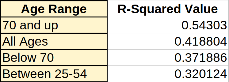
What this shows is a clear progression: the lower the age under consideration, the less the impact a society’s wealth has on prevalence of pancreatic cancer.