4. Property Rights and Economic Development
What defines a successful society? I’m sure you’ve got a pretty good idea what you’d like to be and what you think is the best way to get there. But finding some objective way to measure the success of large populations is much harder.
Economists - being incurable card-carrying data geeks - like to use statistics and financial models as proxies for social success. So let’s see if we can use some of those numbers to inspire useful insights into the problem. In particular, we’re going to look for possible correlations between specific social conditions on one side, and successful economic outcomes on the other.
How Do You Measure Conditions and Outcomes?
Let’s look at outcomes first. One very popular way to assess the economic health of a country is through its gross domestic product (GDP). The GDP is the total value of everything produced within a country’s borders. In theory at least, this number is important. That’s because the higher the GDP - meaning, the more production that’s happening - the more access to capital, employment opportunities, and variety of available consumption choices your citizens will enjoy.
Of course, that’s completely true only in theory. In the real world, the benefits of a strong GDP won’t have an equal impact on every individual. There will always be people who won’t find suitable work in a given economy. And not everyone defines their success through the consumption of material goods.
Still, GDP is a reasonable place to at least begin our analysis.
Now what about measuring the underlying economic conditions that are responsible for economic health? This one can be tricky. Just what are the conditions that lie behind the widest possible enjoyment economic success?
I’m not aware of any single metric that’ll provide this insight. But there have been attempts to build a set of metrics to approximate the kind of rights and freedoms that common sense suggests should accompany a healthy society.
One such attempt is the annual Index of Economic Freedom. The index’s overall score is made up of assessments of a basket of freedoms, including labor, business, spending, and trade, along with other measures like government integrity and respect for property rights.
What makes just those rights and freedoms important? Well, focusing specifically on property rights, imagine how difficult life would be if:
- You had no way of reliably proving that the home you purchased was really yours
- You had no way of reliably proving that the merchandise you purchased for your grocery store was really yours
- You had no way of reliably proving that the royalty rights to the book you wrote are yours
- You had no confidence that the money in your bank account won’t be seized at any moment
Without reliable and enforceable proof, any government or bank official - or any individual off the street - could seize your property at any time. Of course, we can all choose to share our property with the community - as many do through the Creative Commons license - but it should be through choice, not force.
Whatever you think about materialism, living in a society where property rights aren’t respected breeds insecurity. And that’s not a recipe for any kind of success.
Getting the Data
You can get up-to-date GDP data by country from many sources. This Wikipedia page, for instance, includes per capita GDP numbers from three different sources: The International Monetary Fund (IMF), the World Bank, and the CIA World Factbook.
We’ll want our data broken down to the per capita level because that’s the best way to get useful apples-to-apples comparisons between countries of different sizes.
I got my GDP data from the World Bank site, on this page. My Index of Economic Freedom data I took from here.
Here’s how all the basic setup works in a Jupyter notebook:
import pandas as pd
import numpy as np
import matplotlib as plt
import matplotlib.pyplot as plt

gdp = pd.read_csv('WorldBank_per_capita_GDP.csv')
ec_index = pd.read_csv('heritage-all-data.csv')
Running gdp shows us that the GDP data set has got 248 rows that include plenty of stuff we don’t want; like some null values (NaN) and at least a few rows at the end with general values that will get in the way of our focus on countries. We’ll need to clean all that up, but our code will simply ignore those general values, because there will be no corresponding rows in the ec_index dataframe.
gdp

	Country	Year	Value
0	Afghanistan	2019.0	2156.4
1	Albania	2019.0	14496.1
2	Algeria	2019.0	12019.9
3	American Samoa	NaN	NaN
4	Andorra	NaN	NaN
...	...	...	...
243	Low & middle income	2019.0	11102.4
244	Low income	2019.0	2506.9
245	Lower middle income	2019.0	6829.8
246	Middle income	2019.0	12113.2
247	Upper middle income	2019.0	17487.0
248 rows × 3 columns
dtypes shows us that the Year and Value columns are already formatted as float64, which is perfect for us.
gdp.dtypes

Country     object
Year       float64
Value      float64
dtype: object
We should also check the column data types used in our Index of Economic Freedom dataframe (that I called “score”). The only three columns we’ll be interested in here are Name (which holds country names) and Index Year (because there are multiple years of data included), and Overall Score.
ec_index.dtypes

Name                       object
Index Year                  int64
Overall Score             float64
Property Rights           float64
Judicial Effectiveness    float64
Government Integrity      float64
Tax Burden                float64
Government Spending       float64
Fiscal Health             float64
Business Freedom          float64
Labor Freedom             float64
Monetary Freedom          float64
Trade Freedom             float64
Investment Freedom        float64
Financial Freedom         float64
dtype: object
I’ll select just the columns from both dataframes that we’ll need:
ec_index = ec_index[['Name', 'Index Year', 'Overall Score']]
gdp = gdp[['Country', 'Value']]
I’ll then rename the columns in the ec_index dataframe. The critical one is changing Name to Country so it matches the column name in the gdp dataframe. If we don’t do that, it’ll be much harder to align the two data sets.
ec_index.columns = ['Country', 'Year', 'Score']
Next, I’ll limit the data we take from ec_index to only those rows whose Year column covers 2019.
ec_index = ec_index[ec_index.Year.isin(["2019"])]
Now I’ll merge the two dataframes, telling Pandas to use the values of Country to align the data. When that’s done, I’ll select only those columns that we still need: to exclude the Year column from ec_index and then remove rows with NaN values. That’ll be all the data cleaning we’ll need here.
merged_data = pd.merge(gdp, ec_index, on='Country')
merged_data = merged_data[['Country', 'Value', 'Score']]
merged_data.dropna(axis=0, how='any', thresh=None,
                   subset=None, inplace=True)
Visualizing Data Sets Using Scatter Plots
It’s not uncommon for data cleaning to take up more time and effort than the actual visualization. This will be a perfect example. Just this simple, single line of code will give us a lot of what we’re after:
plt.scatter(merged_data.Score, merged_data.Value)
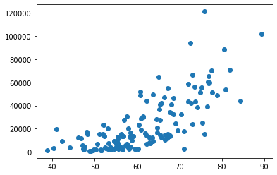
What that did was take the two data points (GDP and index) for each country and plot a dot at its intersection point. The higher a country’s index score, the further along to the right it’s dot will appear. And the higher its per capita GDP, the higher up the y-axis it’ll be.
If there were absolutely no correlation between a country’s GDP and its index score (or, in other words, the economic freedoms had no impact on production) then you would expect to see the dots spread randomly across both axes. The fact that we can easily see a pattern - the dots are clearly trending towards the top-right of the chart - tells us that higher index scores tend to predict higher GDP.
Of course there are anomalies in our data. There are countries whose position appears way out of range of all the others. It would be nice if we could somehow see which countries those are. And it would also be nice if we could quantify the precise statistical relationship between our two values, rather than having to visually guess. I’ll show you how those work in just a moment.
But first, one very small detour. Like everything else in the technology world, there are many ways to get a task done in Python. Here’s a second code snippet that’ll generate the exact same output:
x = merged_data.Score
y = merged_data.Value
plt.scatter(x,y)
There will be times when using that second style will make it easier to add features to your output. But the choice is yours.
Adding “Hover” Visibility
Now let me get back to visualizing those anomalies in our data - and better understanding the data as a whole. To make this happen, I’ll import another couple of libraries that are part of the Plotly family of tools. You may need to manually install on your host using pip install plotly before these will work. Here’s what we’ll need to import:
import plotly.graph_objs as go
import plotly.express as px
From there, we can run px.scatter and point it to our merged_data dataframe, associating the Score column with the x-axis, and Value with the y-axis. So we’ll be able to hover over a dot and see the data it represents, we’ll add the hover_data argument and tell it to include Country and Score data.
fig = px.scatter(merged_data, x="Score", y="Value", log_x=True,
                 hover_data=["Country", "Score"])
fig.show()
This time, when you run the code, you get the same nice plot. But if you hover your mouse over any dot, you’ll also see its data values. In this example, we can see that the tiny - but rich - country of Luxembourg has an economic freedom score of 75.9 and a per capita GDP of more than 121 thousand dollars.
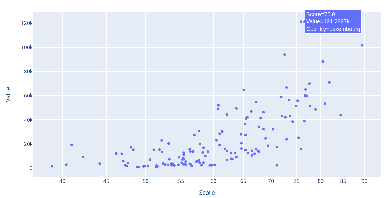
That’s an important functionality, particularly when it comes to quickly identifying statistical outliers like Luxembourg.
Adding a Regression Line
There’s one more important piece of information that’ll improve how we understand our data: its R-squared value.
We already saw how our plot showed a visible trend up and to the right. But, as we also saw, there were outliers. Can we be confident that the outliers are the exceptions and that the overall relationship between our two data sources is sound? There’s only so much we can assume based on visually viewing a graph. At some point, we’ll need hard numbers to describe what we’re looking at.
A simple linear regression analysis uses a mathematical formula to provide us with such a number: y = mx + b - where m is the slope of the line, and b is the y-intercept. This will give us a coefficient of determination (also described as R-squared or R^2) that’s a measure of the strength of the relationship between a dependent variable and the data model.
R-squared is a number between 0 and 100%, where 100% would indicate a perfect fit. Of course, in the real world, a 100% fit is next to impossible. You’ll judge the accuracy of your model (or assumption) within the context of the data you’re working with.
How can you add a regression line to a Pandas chart? There are, as always, many ways to go about it. Here’s one I came across that, if you decide to try it, will work. But it takes way too much effort and code for my liking. It involves writing a Python function, and then calling it as part of a manual integration of the regression formula with your data.
Look through it and try it out if you like. I’ve got other things to do with my time.
def fit_line(x, y):

    x = x.to_numpy() # convert into numpy arrays
    y = y.to_numpy() # convert into numpy arrays

    A = np.vstack([x, np.ones(len(x))]).T
    m, c = np.linalg.lstsq(A, y, rcond=None)[0]

    return m, c

fig = px.scatter(merged_data, x="Score", y="Value",
                 log_x=True,
                 hover_data=["Country", "Score"])
# fit a linear model
m, c = fit_line(x = merged_data.Score,
                y = merged_data.Value)

# add the linear fit on top
fig.add_trace(
    go.Scatter(
        x=merged_data.Score,
        y=m*merged_data.Score + c,
        mode="lines",
        line=go.scatter.Line(color="red"),
        showlegend=False)
)

fig.show()
So what’s my preferred approach? It’s dead easy. Just add a trendline argument to the code we’ve already been using. That’s it. ols, by the way, stands for “Ordinary Least Square” - which is a type of linear regression.
fig = px.scatter(merged_data, x="Score", y="Value",
                 trendline="ols", log_x=True,
                 hover_data=["Country", "Score"])
fig.show()
Here’s how our chart looks with its regression line:
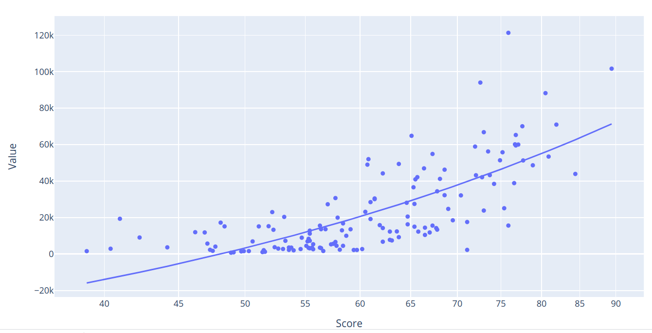
When I hover over the regression line, I’m shown an R^2 value of 0.550451. Or, in other words, around 55%. For our purposes, I’d consider that a pretty good correlation.
Other Considerations
When interpreting our plots, we should always seek to validate what we’re seeing in the context of the real world. If, for instance, the data is too good to be true, then it probably isn’t true.
For example, residual plots, the points that don’t fall out right next to the regression line, should normally contain a visually random element. They should, in other words, present no visible pattern. That would suggest a bias in the data.
We should also be careful not to mix up correlation with causation. Just because, for instance, there does seem to be a demonstrable relationship between economic freedoms and productivity, we can’t be absolutely sure which way that relationship works: do greater freedoms lead to more productivity, or does productivity (and the wealth it brings) inspire greater freedom?
In addition, as I mentioned at the start of this article, I’d like to explore other measures of social success besides GDP to see if they, too, correlate with economic freedom. One possible source of useful data might be the Organisation for Economic Co-operation and Development (OECD) and their “How’s Life? Well-Being” data set. But that will have to wait for another time.