7. Do Birthdays Make Elite Athletes?
Do Birthdays Matter in Sports?
I’ll begin with the question I’m going to try to answer: are you more likely to succeed as an elite athlete if your birthday happened to fall early in the calendar year?
It’s been claimed that youth sports that divide participants by age and set the yearly cutoff at December 31 unwittingly make it harder for second-half-of-the-year players to succeed. That’s because they’ll be compared with players six to ten months older than them. At younger ages, those months can make a very big difference in physical strength, size, and coordination. If you were a minor league coach looking to invest in talent for a better team in a stronger league, who would you choose? And who would likely benefit more over the long term from your extra attention?
This is where the well-known writer, thinker, (and fellow Canadian) Malcolm Gladwell comes in. Gladwell wasn’t actually the source of this insight (although he’s the one most often associated with it). Rather, those honors fall to the psychologist Roger Barnesly who noticed an oddly distributed birthdate pattern among players at a junior hockey game he was attending. Why were so many of those talented athletes born early in the year? Gladwell just mentioned Barnesly’s insight in his book, Outliers, which was where I came across it.
But is all that true? Was Barnesly’s observation just an intriguing guess, or does real-world data bear him out?
Where Does the NHL Hide Its Data?
A couple of my kids are still teenagers so, for better or for worse, there’s no escaping the long shadow of hockey fandom in my house. To feed their bottomless appetites for such things, I shared with them the existence of a robust official but undocumented API maintained by the National Hockey League. This URL:
https://statsapi.web.nhl.com/api/v1/teams/15/roster
…for instance, will produce a JSON-formatted dataset containing the official current roster of the Washington Capitals. Changing that 15 in the URL to, say, 10, would give you the same information about the Toronto Maple Leafs.
There are many, many such endpoints as part of the API. Many of those endpoints can, in addition, be modified using URL expansion syntax.
Fun fact: if you look at the site icon in the browser tab while on an NHL API-generated web page, you’ll see the Major League Baseball trademark. How did that happen?
How to Use Python to Scrape NHL Statistics
Knowing all that, I could scrape the endpoint for each team’s roster for each player’s ID number, and then use those IDs to query each player’s unique endpoint and read his birthdate. After selecting only those players who were born in Canada (after all, those are the only ones I know about whose cutoff was on December 31), I could then extract the birth month from each NHL player into a Pandas dataframe where the entire set could be computed and displayed as a histogram.
Here’s the code I wrote to make all that happen. We begin, as always, by importing the libraries we’ll need:
import pandas as pd
import requests
import json
import matplotlib.pyplot as plt
import numpy as np
Next, I’ll create an empty dataframe (df3) that’ll contain a column called months. I’ll then use an if loop to read through all the team IDs between one and 11 (more on that later) and insert the value of each iteration of team_id into a “roster” endpoint address. The .format(team_id) code does that.
I’ll then read the data from each endpoint page into the variable r, and read that into a dataframe called roster_data. Using pd.json_normalize, I’ll read the contents of the roster section into a new dataframe, df.
I’ll run that through a new nested for loop that’ll apply df.iterrows that will add the birthdate data from each new roster page that the next lines of code will scrape. As we did before for teams, we’ll insert each person.id record into the new endpoint and save it to the variable url. I’ll then scrape the birthDate field for each player, read it to the birthday variable and, after first stripping unnecessary characters, read that to newmonth. Finally, I’ll pull the birthCountry status from the page and, using if, drop the player if the value is anything besides CAN.
All that will then be plotted in a histogram using df3.months.hist(). Take a few minutes to look over this code to make sure it all makes sense.
df3 = pd.DataFrame(columns=['months'])
for team_id in range(1, 11, 1):
    url = 'https://statsapi.web.nhl.com/api/v1/teams/{}/roster'.format(team_id)
    r = requests.get(url)
    roster_data = r.json()
    df = pd.json_normalize(roster_data['roster'])
    for index, row in df.iterrows():
        newrow = row['person.id']
        url = 'https://statsapi.web.nhl.com/api/v1/people/{}'.format(newrow)
        newerdata = requests.get(url)
        player_stats = newerdata.json()
        birthday = (player_stats['people'][0]['birthDate'])
        newmonth = int(birthday.split('-')[1])
        country = (player_stats['people'][0]['birthCountry'])
        if country=='CAN':
            df3 = df3.append({'months': newmonth}, ignore_index=True)
        else:
            continue
df3.months.hist()
Before moving on, I should add a few notes:
-
Be careful how and how often you use this code. There are nested for/loops that mean running the script even once will hit the NHL’s API with more than a thousand queries. And that’s assuming everything goes the way it should. If you make a mistake, you could end up annoying people you don’t want to annoy.
-
This code (
for team_id in range(1, 11, 1):) actually only scrapes data from eleven teams. For some reason, certain API roster endpoints failed to respond to my queries and actually crashed the script. So, to get as much data as I could, I ran the script multiple times. This one was the first of those runs. If you want to try this yourself, remove thedf3 = pd.DataFrame(columns=['months'])line from subsequent iterations so you don’t inadvertently reset the value of your DataFrame to zero. -
Once you’ve successfully scraped your data, use something like
df3.to_csv('player_data.csv')to copy your data to a CSV file, allowing you to further analyze the contents even if the original dataframe is lost. It’s always good to avoid placing an unnecessary load on the API origin.
How to Visualize the Raw Data
Ok. Where was I? Right. I’ve got my data - the birth months of nearly 1,100 current NHL players - and I want to see what it looks like. Well wait no longer, here it is in all its glory:
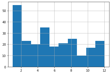
What have we got here? Looks to me like January births do, indeed, account for a disproportionately high number of players but, then, so does December. And, overall, I just don’t see the pattern that Gladwell’s idea predicted. Aha! Shot down in flames. Never trust an intellectual!
Err. Not so fast there, youngster. Are we sure we’re reading this histogram correctly? Remember: we’re just starting out in this field and learning on the job. The default settings may not actually have given us what we thought they would. Note, for instance, how we’re measuring the frequency of births over 12 months, but there are only ten bars in the chart!
What’s going on here?
What Do Histograms Really Tell Us?
Let’s look at the actual numbers behind this histogram. You can get those numbers by loading the CSV file you might have earlier exported using df3.to_csv('player_data.csv'). Here’s how you might go about getting that done:
import pandas as pd
df = pd.read_csv('player_data.csv')
df['months'].value_counts()
And here’s what my output looked like (I added the column headers manually):
Month Frequecy
5     35
2     29
1     26
8     25
3     23
7     21
4     20
6     18
10    17
12    13
11    10
9     10
Looks like there were nearly double the births the first four months of the year than in the final four. Now that’s exactly what Gladwell’s prediction would expect. So then what’s up with the histogram?
Let’s run it again, but this time, I’ll specify 12 bins rather than the default ten.
import pandas as pd
df = pd.read_csv('player_data.csv')
df.hist(column='months', bins=12);
A “bin” is actually an approximation of a statistically appropriate interval between sets of your data. Bins attempt to guess at the probability density function (PDF) that will best represent the values you’re actually using. But they may not display exactly the way you’d think - especially when you use the default value. Here’s what we’re shown using 12 bins:
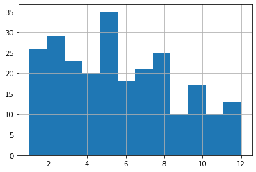
This one probably shows us an accurate representation of our data the way we’d expect to see it. I say “probably,” because there could be some idiosyncrasies with the way histograms divide their bins I’m not aware of.
Make Sure to Use the Right Tools For the Job
But it turns out that the humble histogram was actually the wrong visualization tool for our needs.
Histograms are great for showing frequency distributions by grouping data points together into bins. This can help us quickly visualize the state of a very large dataset where granular precision will get in the way. But it can be misleading for use-cases like ours.
Instead, let’s go with a plain old bar graph that incorporates our value_counts numbers. I’ll pipe the results of value_counts to a dataframe called df2 and then plot that as a simple bar graph.
df2 = df['months'].value_counts()
df2.plot(kind='bar')
Running that will give us something a bit easier to read that’s also more intuitively reliable:
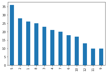
That’s better, no? We can see the months (represented by numbers) displayed in order of highest births with five of the top six months occurring between January and May.
The moral of the story? Data is good. Histograms are good. But it’s also good to know how to read them and when to use them.